Here’s the PDF file for the finished version of the listings feature:
Alvin’s Finished Listings Feature
Here’s the JPEG file:


Here’s the PDF file for the finished version of the listings feature:
Alvin’s Finished Listings Feature
Here’s the JPEG file:
Here’s the pdf file for my finished newspaper advert cover
Alvin Maduli’s Finished Newspaper Advert
Here’s the JPEG file:

For this feature, I made a rough layout to get some idea of how it will look like:
 I considered what sort of supplements to add in the double page spread after doing some research on existing magazine features, so I considered adding pull quotes, image details, headline and subheading etc.
For the article, it will be an interview with one of the main voice actors and co-writer of the radio drama, talking about the process with the script and how it is like working with the other voice actors.
Then I started using InDesign on the mac. Using an A3 layout, the first thing I did was to place the background; which has been already edited in Photoshop (using motion blur, similar to the front cover background), then placing the main image (in which quick selection tool has been used to crop out the background).

What I did was to change the opacity of the main image so it has that fade effect and blends with the background. I changed the opacity from 100% to 70% so it does not look too faded.

For the headline, I used a font from the website dafont, and used the colours red, white and black as they all represent a thriller theme. Then I used a drop shadow so that it stands out.
For the subheading, I used a plain white font but highlighted some key words like the actor’s name and the name of the radio drama to red so that it stands out. I did the same to the pull quote with the word “frustrating” so it looks interesting.
For the article, I had to create a box behind the text so the text can be read:

So I selected the rectangle tool

Then changed the opacity to 85% so the background can still be seen but can still read the text. I used a simple black font so it stands out with the faded white box.
 I then changed the front style for the questions in the article so it can be read clearly. So I made it slightly bolder.
Then I added the supplements for a conventional magazine feature; image details, page numbers, name of magazine and issue number, details for the radio drama; running time, radio station and radio drama name. I also added a bold line at the top of the page, with “Interview” just at the top right of the second page.
 To help create my double page spread feature for my radio drama, I had to analyse an existing feature from existing magazines like Radio Times to demonstrate a few forms and conventions that were used relating to the theme or storyline of the radio drama. This helped me create a few ideas of what conventions I could use to promote the target audience.
The double page feature is fairly simplistic and could attract the older demographic (between 25 and 40) because the show related to the article Hustle is aimed at that target audience. The fonts used is simple, Times New Roman and the important titles in the subtitle is in bold so it stands out. The bold heading grabs the audience’s attention and gives and idea what the article is about and the main image supports it. The main conventions used though were the pull quote that is in the article. They pick out a certain quote that could be interesting and leads the audience to read further, and it shows what the audience would expect from the article. Another convention are the pictures used that relates to the article. The bigger picture shows that they are the main subject in the article. The characters in the image wear formal clothing and in a studio which gives some idea what the article or the show is about. The second images is smaller which could slightly relate to the article (mentioned in the article). The white background and the black font for the article does not really clash making it slightly difficult to draw attention and makes the audience focus more on the image. Another convention used is the main details of the show e.g the date the show starts and what channel. This is a way to promote the show and audience would check it out if they liked the article. The main image is placed on the right which is placed perfectly as if it was placed in the middle where the folding of the magazine is, it would be less attractive and would stand out less. The date of the issue is placed right and so is the page numbers. Image details is also used giving information about the image as a form of advertisement.
Overall, there are conventions used in this double page feature but it is too simple. Although, it is targeted at an older demographic so it just attracts the right audience. As my target audience for my radio drama is almost similar to this one, I will use some conventions used here but also improve on some areas like the fonts. But this double page feature is a great example and helped create some ideas.
The first I did to start my poster for my radio drama is building a mindmap and get some ideas of what I could add to my poster:

Then this was my rough layout of my poster:

Then I used the program Photoshop after taking some pictures, and the first thing I did was to edit out the background so I can put a different background, which will be a picture of a London trademark.
Using the quick selection tool, I highlighted the main image that I want to select.

Then I adjusted the edge so it looks professional. I did that by smoothing the edge and output it to a new layer. I did that to two images of the two main characters of the radio drama. The next thing I did was to edit my background.
What I did for the main background was to create a motion blur effect to it to make it look edgy.

So I chose the motion blur and made the distance to 15 pixels so it doesn’t look too blurry that the London landmark will be hard to notice.


I then placed the images of the two characters and then added the title and text. For the title, I used a font from a website called dafont and just placed it vertically. This was the first draft.
Then I changed the background as I found the colour too boring. Then I added the supplements like the radio station logo, the date and time, and a pull quote from a review.
To help create my poster for my radio drama, i have analysed a few posters to demonstrates a few forms and conventions that were used relating to the theme or the actual story. As my radio drama belongs in the thriller genre, I researched a few existing thriller genre movie and radio drama posters.
1 – THE INVISIBLE MOVIE POSTER
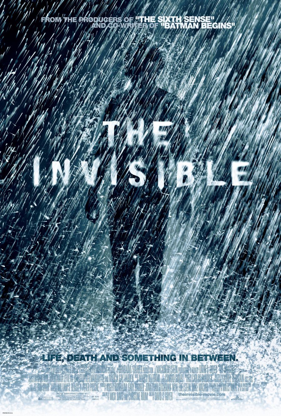 There are several conventions used to classify the film as a thriller film. The tone of the poster looks very dark and mysterious as the character is shadowed and hardly see his whole appearance. The rain complements the dark element to the poster. The title used in the middle blends in with the rain, making it more mysterious. The tagline used; “Life, Death and something in between” exposes little of what the film is about, which could interest the target audience which is mainly male around 18-40 years in the western culture. A promotion strategy is used; adding the crew involved who has other films “The Sixth Sense” and “Batman Begins”, which could interest other audiences who like those films and also could relate to the film as The Sixth Sense and Batman Begins belongs in a thriller film and because they had box office and critical acclaim, it might make the audience believe it will be good. As the poster does not give much away, I think this is a sophisticated poster that works well.
2 – TAKEN MOVIE POSTER
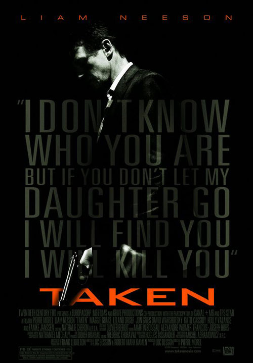
There are lots of conventions used in this poster that would classify the film as thriller film. First of all, the props and costumes also used indicates that it’s a thriller film; man wearing a suit and holding a gun. There are only two colours used as a font; orange and grey, and the orange font really stands out as the whole poster itself is very dark, and the orange font used for the lead actor and the film title itself works very well. The lead actor, who also done other successful films like Schindler’s List and Star Wars I: The Phantom Menace, helps promote this film well and the fact that it stands out with the orange font draws attention and a great example of mode of address. The tagline, assuming is a quote from the film, gives away what the film is about and clearly indicates it’s a thriller genre; story about a man killing people in order to find his daughter. The target audience is mainly male in the 18-40 year group, mainly in the western culture as the tagline indicates how much violence and brutality there will be in the film. The poster didn’t need to add the crew involved who has also done other well known films that other people might be familiar of as the poster itself is professional enough and is a great example of mode of address. Overall, it is an effective poster.
3 – TORCHWOOD: THE DEAD LINE RADIO POSTER
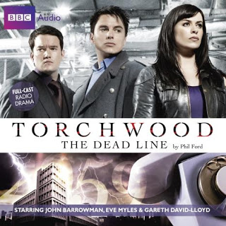
There are several conventions used to classify the radio piece as a thriller but it’s quite hard to indicate. The poster doesn’t give much info about the story, but some conventions is used. For example, the characters in the poster is wearing smart and sophisticated clothing except for the female character, which gives little indication that it’s a thriller radio drama. I think the target market is men and women in the age of 18-40 as the characters are both male and female aged 25-35 and they could relate to the characters. With the cast listed at the bottom of the poster, the audience might have known them from other projects. I think this is a sophisticated radio poster but it doesn’t give much information.
